The site is running reasonably well again so I’ll celebrate with a link to an article on fountain pens from a Manila paper. If you read closely you may see a familiar name.
Just click here.

Shaking my head with resignation masquerading as wisdom
The site is running reasonably well again so I’ll celebrate with a link to an article on fountain pens from a Manila paper. If you read closely you may see a familiar name.
Just click here.
About 4 hours into the DC Fountain Pen Supershow I burn out. The way I feel when I get there is like this: 1. Overwhelmed; 2. Confused; 3. Equilibrium; 4. Burn Out.
There is so much to see, do, and talk about for one man to do.
I’ve written a few posts about this show in the past (here and here) and it’s basically the same now as it was then. Thus, let me share some snapshots with you.


I’ve become subterranean. I’m not a bat yet but I’ve moved all my pen repair tools, parts, and various oddities down to my basement. Combine that with a desk, shelves, lights, and a chair and I’ve created what I now call a pen cave. The reason for this was more than just getting all this out of my home office to a larger area but a step to be more professional since I plan to start offering my repair services for a fee. So from now on I’ll be generating posts from the dark pen cave and having Alfred bring me some snacks while I do so. OK, there’s no Alfred and no pole I can slide down and be garbed in a fancy outfit but it’s the same idea.

I’m a sucker for classic design and the Pelikan 100N is a prime example. I love the celluloid barrel sleeve’s contrast to the ebonite parts along with the proportions of cap and body. Its squared off look seems just so right for something from the golden era of fountain pens. Overall I think anyone could see it’s an unassuming, refined design that quietly proclaims good taste.
It’s under the exterior where this pen shines to me the most. Teutonic manufacturers have been and continue to be the Rock of Gibraltar for piston mechanisms having popularized and improved that means of filling for many years. There’s good reason for sticking by it since it’s a reliable, efficient, and satisfying way to move writing liquid into your pen. The downsides are that there are methods with greater ink capacity, fewer moving parts, and lower cost. Whatever drawbacks you come up with no other filling method can capture the exquisite feel of watch-like precision you get from twisting the piston knob slowly and smoothly when the pen is submerged in an ink bottle.
How piston fillers work is simple enough that anyone can understand from the briefest of outlines: The barrel of a pen is a tube and if the end of that tube is moved upwards expanding the empty space inside you get negative pressure. If you create that void while the end of the tube (with nib and feed attached) is in ink then ink is drawn in. Nature abhors a vacuum and so does a fountain pen. Even the specific parts are very simple in this system since basically all you need is a seal which acts as the air-tight end of inner barrel, a long rod like screw inside an internally threaded shaft which the seal attaches to, a fixed end collar which keeps the shaft straight so it goes up down when turned by a knob attached to the screw.

If you look at the picture of the disassembled Pelikan 101N above you see the aforementioned parts and a few others which make the pen a pen and not just a piston. What warms my heart about this vintage pre-war design is the excellent engineering. There is only the minimum number of parts needed to make this pen work well. No fancy or illogical bits thrown in much like how the pen’s appearance forswears the gaudy. All of the pieces come apart easily (as easily as they could on a pen over a half century old) and fit back together with no fuss. The piston seal snaps onto the end of the rod without needing any form of fastening using the elasticity of the material to hold it on like a bottle top. I can take this pen to pieces and have it back together in seconds which makes me feel a bit like a fictitious action hero who can field strip and reassemble his weapon blindfolded in minutes. The successor line to the 100N (400/400N/400NN) replaced this screw in piston with a friction fit one (which continues today on the lower end Pelikans) and while still a fine pen I’m not quite enamored of that change which makes repair more difficult.
Of course if the pen didn’t work well then all I’ve said would be much ado about nothing but it does. This should not be a surprise since the ink delivery and transfer mechanism here reflects the refinements of the 70 odd prior years of fountain pen making. The open nib and finned hard rubber feed with dual fissures are conservative and well proven to do the job. Pelikan nibs are known to be high quality units that have always been shaped and ground well so no problem there. Probably the large green ink window is the showiest bit of this pen but also extremely useful and welcome. All in all if not an exciting pen to use one that won’t let you down.

If I were asked what classic fountain pen someone should get first based on price, quality, and design I would be hard pressed to think of anything better than a Pelikan 100N. While not flashy it is one of the jewels in fountain pen history.
Flexible nibs (which I did an earlier post about here) are often coveted but just as often misunderstood by fountain pen collectors. That’s to be expected since nearly all current pens have nibs that flex very little. If not stiff then they are what is often called “soft”, a term that means under some pressure the tines will spread a tiny bit.
So why are flex nibs so coveted and how do you get one? People can get sold on them sight unseen due to all the dialogue praising them but don’t know of the downside. Most new owners would find them hard to use on a daily basis. You have to take your time writing with one and the necessary high ink flow means a lot of drying time which leads to disappointment and some grumbling you don’t often see expressed due to embarrassment. If given a little perseverance (and practice) most folks do come to enjoy their use.
Getting the real McCoy usually involves finding a good vintage pen from the golden era of flexibility which ended in the late 1930s. It’s a hard quest since so many people selling “flexible” nib pens have no idea what that adjective really means in those cases. Thus caveat emptor needs to be strongly observed so you don’t wind up holding a nail when you wanted a noodle. Trying out pens in person or buying from a known, recommended, or trusted seller is really a very, very good idea.
The other way to obtain a flexible nib also can be tricky. Some very high end manufactures have special order flexy ones and some nibmeisters can alter what you have on hand to be such for a hefty price. People debate the qualities of these all the time asking if they are truly flexible or just rigid with a lazy streak. Results do indeed vary.
Now Into this comes a new much talked about entry from Noodler’s, the people well known for ink and low cost fountain pens. The Nib Creaper (or NC since I’m lazy) is billed to have a flexible nib on a very low cost pen. Intriguing, yes? Well I’ve managed to get my hands on a couple through the auspices of kind friends and took some time to get to know it. Let’s take a look.

Do you like the look of the exsisting Noodler’s piston fill fountain pens (as shown here)? If you do then you’ll like the Nib Creeper. I don’t find the design unattractive or all that attractive. It’s a nice generic pen shape with little adornment. There’s nothing wrong with that, as I said before, since it’s an inexpensive pen. For this price point you don’t expect too much and just the fact this is a piston filled pen is a nice surprise.
This is one of the cheapest new piston filling fountain pen I can think of. The Dollar Pen rivals it for price but I’ve had no experience with them so I can’t comment on quality. Oh, and the Dollar does not have a fancy nib. The TWISBI piston filler is a fine pen and built to a much higher level of quality but it goes for nearly 4 times the price of the Nib Creaper. If someone wants to get away from converters or cartridges first stop is here.
How long a Noodler’s pen such as this will last in use is an open question. It looks to me built to perform a good long time and you can buy new piston seals from Noodler’s to replace worn ones (a nice touch.) The design is straight forward and simple much like the “school pens” from European manufacturers in the 50s and 60s. You see the minimum of parts to get the job done on this pen so rough handling should not break it.
Now that we’ve discussed the supporting cast let us get to the star of this pen: The new flexible nib. If you look at the overhead comparison shot between a regular Noodler’s and the NC’s steel nib you immediately see the difference. The slit on the normal nib is goes part way up and ends in a breather hole. No surprise there since it’s the classic nib look and the one people visualize when thinking of one.


One thing about flex nibs that people should know about is that they need a lot of ink. When they are flexed to make a thick line they have to put down a wide swath of that liquid stuff and if there’s not enough ink coming up through the feed they “railroad”. That means each tine makes a thin line and there is a blank nothingness between them. That is bad. Now if there is enough ink to cover that gap you see a very wet line indeed. The balance between too much and too little ink is usually in major part controlled by the feed of the pen. Of course I should mention there is always a point where railroading will happen if a nib is flexed really far and capillary attraction loses out to gravity and other forces.
Flexy pen feeds that work well have deep channels holding ample ink ready to be called upon when needed. In the picture below I’ve taken a few photos of the regular Noodler’s piston fill feed and the one from the NC. I love that these are great looking old school ebonite feeds since it’s nice to see something made today that looks just like it’s counterpart from 100 years past. No molded plastic fanciness here, just good old lathed hard rubber.


We all know the real question everyone wants answered about this pen is how flexible is the nib really? Using it gives an impression but that is subjective and hard to relate in words. One person’s flexible nib is another’s rock hard nail like scratching device.
What I had to figure out was how to test and show the Creaper’s flexnibedness. A comparison between a vintage pen I think anyone would describe as having a flexible nib and this modern upstart made sense. Looking for a good wet noodle as a comparator I was lucky to have a vintage model also sporting a steel nib (even better for the comparison) on hand. This flag bearer for flex is a 50s Montblanc that can accelerate from narrow line to wide in the wink of an eye. Once that choice was made I moved forward to formulate a hair brained scheme.
What I needed was a way to illustrate how much flex there was using the same downward writing pressure on both pens. After a great deal (practically minutes) of thought I came up with two options which could work. In the first one I would buy expensive equipment to apply the exact same measured force to both pens and run a moving belt of paper underneath to capture the lines. Then I use magnification and a micrometer to measure the line width to high accuracy.
Yeah, right. I’m lazy and all for loose, unscientific tests that don’t cost me anything so I selected the second path: duck tape. Since it can do anything I figured it would provide me a cheap and cheerful testing solution. So what I did was tape both pens together with the points at an equal level to each other and on the same plane.. With that done I made lines across the paper increasing the pressure as I went. Since the pens are, so to say, a single unit the pressure was pretty equal on both.


My use bears out what the duck tape experirama shows in that the Noodler’s pen was not an entirely willing flexible partner. It takes a good deal of pressure to get line variation and that makes it a bit less enjoyable.
The next issue is that both nibs I tried were a bit scratchy. I’ve read some people’s reviews where they state the pen was very smooth so this may just be an anomaly or maybe I am a tougher judge of smoothness. As always this is something you will have to see for yourself.
My last comment has to do with ink supply. Even with the modified feed the pen railroads quite a bit. To stop this you can write slowly and deliberately which slows the rate of ink being put on paper so the flow can keep up. This is something some flexible nib pens require but it can be a bit exasperating.

Everything I said in my review of the normal Noodler’s piston filled pen goes for this one. It’s a featherweight pen which makes the NC easy to use and carry. The piston works as advertised and there are convenient ink windows in the barrel to see the level of such. On top of all this is a screw cap which is my favorite method of holding one on.
A fountain pen that is this inexpensive makes me want to play up the positives and minimize the negatives. You get good value for your money with a Noodler’s Nib Creaper for sure but as with all things you do get what you pay for. That turns out to be a fun pen to use but not an amazing wet-noodle nib writing experience. For that your best bet still is going for a vintage pen.

It’s a newly minted year but I shan’t be going on about auld lang syne. I’m going to look back only a few days to this past Christmas and one gift in particular. I was given a lovely pen which I was not expecting in the least and it surprised the heck out of me. Earlier in the year I was spied examining this particular writing instrument finding it quite interesting and now, suddenly, I own it.
I have a tendency to ramble (although when I write these posts the words come out at a glacial pace) and with this pen I’m going to give myself an underlying structure for this and future reviews. I’ll keep things in a format like this:
1. Introduction
2. Appearance
3. Engineering and Features
4. Relevant Comparison
5. Usage Comments
6. Summary
So let’s give this a shot with the aforementioned pen: A Lamy Dialog 3 (or D3 for short.)

Lamy pens often attract the adjective of “Bauhaus” when described. That famous design school (Staatliches Bauhaus) is well known for clean, machine age creations that are often associated with the aphorism “form follows function.” (Because Louis Sullivan is my favorite architect I must insert that he coined that phrase long before used in this context.) Lamys are smooth and modern and if you are familiar with the metal tubular furniture from Bauhaus designers you can see a similar rationale and resemblance. Pushing the envelope in this direction keeps all the new Lamy designs looking fresh.
The above brand of modernism can be seen in The Dialog 3 (even though it was designed by the Swiss Franco Clivio) and it is a pen that elicits strong reactions. It’s one of the least adorned pens I’ve seen and resembles a cigar tube. This design is broken only by the slender clip and access hole for the nib on one end. Textured and shiny metal is what you see and what you feel holding it. People could be confused and not even take it for a writing instrument.
I’ve read many comments on this pen and a large number of those are negative. Some have joked it needs an LED so it can become the penlight it was born to be. I’ve read even more colorful commentary on what it might look like (ahem, tampon). In my eyes I find the shape simple and compelling. I appreciate this unadorned mechanical appearance in many items from Porsche Design watches to Braun appliances so I’m predisposed to a favorable impression. Looking like some kind of tool is not terrible for what is really a tool to write.
It used to be said Germans over engineered everything due to their skill and perfectionism. The gist of that idea is elegant engineering cuts no corners and exceeds all specifications. Lamy’s Dialog 3 fits well into that ethos. To begin with you can see the quality in its manufacturing on close inspection. You see smooth threads; polished internal parts, and well dampened movements. From the exquisitely knurled grip on the nib unit to the rotating half spheroid that acts as seal on the nib end the feeling of no cut corners comes on strong.


Of course there is a down side to this feeling of quality and that is weight. The pen is quite heavy which I can see turning a few people off. It feels like it was machined from a solid block of steel. Good? Bad? It’s a matter of preference, of course. It doesn’t bother me since I can adapt to massive or featherweight pretty easily.
There are three parts when the pen is disassembled (not counting the converter): The top section, the nib section, and the bottom section. The pen is separated by twisting the bottom past a detent in the direction that you would to retract the nib. Once apart the nib and feed come out in a unit which unscrews from the bottom of the pen. You can run water through or soak this for cleaning.
As if this pen wasn’t already complex enough the clip even has to show off. It’s on a spring tensioned hinge so it slips over fabric easily. Showier is how when the nib is extended the clip will actually move closer to the barrel and lock into place unusable. Even the most absent minded user won’t wind up with the nib staining any article of clothing.
The obvious pen to compare the D3 to is the most popular retractable nib model on the market: The Pilot/Namiki VP or Vanishing Point (sometimes also called the Capless.) I have one from the 1980s which is similar to some of the current models in length and girth. You’ll see when it is placed next to the Dialog 3 there is quite a size difference. You’ll next notice the push button on the end of the Namiki which denotes a functional difference. This pen extends the nib by pushing this button like a click ballpoint. Compared to the D3 it has a simpler mechanism, a flap to close off the nib end, and a fixed clip.


In use the VP feels light as air in comparison to the D3 (mine has a plastic barrel but newer VP models have a brass one and weigh substantially more). As with all retractable point fountain pens you will have to deal with holding the clip end and some people with different gripping styles can find this problematic. Usability testing ends there since I can’t compare the much smaller Capless nib which was ground to italic with the Lamy’s medium.
What can I say? I like using this pen. It took a little time to get used to handling its thick and hefty body. I don’t find it uncomfortable though and it has a nice cool tactile feel on my fingers. It’s no nonsense, here to write, and don’t forget that.
The twist action to extend the nib is easy to get used to after a few instances of disassembling the pen when turned it too far but that is certainly not the worst learning curve in the world. Once opened it starts to write without hesitation. I’ve read some people have had their Dialog 3s dry up easily which hasn’t happened to me. I assume if that was a problem with the pen it has been fixed as production moved along or the inks I use are more resistant to drying than those of other folks.
The nib is nothing fancy. Two tone 14kt gold and slightly plain looking it won’t shock you but that is fitting to this pen. The range of points available will elicit a yawn as bold is about as fancy as it gets. Mine is the often hated medium and it creates a textbook example of that line width. So much so I won’t bother with an exemplar of the writing since you should be able to picture it well if you’ve ever used a medium nib. My example is very, very smooth with good flow in use, perhaps the smoothest nib I own. Once again I’ve read some people have flow problems which may have been fixed by the time my pen was made. The smooth, slightly soft nib makes writing with it is no chore and for a daily use pen I couldn’t ask for more.
I said this pen was polarizing before and I can’t stress “try before you buy” more in this case. You may hate what I find lovely about the Lamy Dialog 3. It’s big, solid, complex and these attributes could both be positives or negatives depending on your predilections. Over the last few weeks the D3 has performed reliably and I’ve enjoyed using it which about sums this all up.
Whitefort, the place, looks to be mostly a road sign on a country road in Ireland near Thurles with no industry I can see. The length of the nave of the French cathedral of Saint Etienne of Bourges is 333 feet. Now you know the irrelevant information I discovered in a search about the pen I’m holding now: the Whitefort 333.

Not everyone loves a mystery and I would like to know more about this intriguing pen but that info seems lost in the sands of time. It’s an amazingly crafted piece precisely made from machined clear plastic like most mid-20th century display pens. All the parts have exacting tolerances and fit perfectly. Was this one of a few demonstrators made or one of a thousand production models? No idea. Nothing looks prototypical about it under close inspection. The only clues of identity is a clip engraved “W 333” and a nib and cap band engraved “Whitefort 333”. There are no markings on the barrel or other plastic parts.

The nib itself deserves some further comment. It’s marked “14ct” and is two-tone with a band of bright silver plating on the leading edges. Seeing “ct” instead of “kt” here indicates it wasn’t made in North America so that’s at least a bit of useful detail. This is a nicely made nib which reminds me of the similar two tone ones some vintage Onotos had on them.
Can we make any useful guess on this fountain pen’s provenance after this examination? Maybe a half-baked guess is the best we can do. The gold content marking and the name leads me to believe this pen was made in English speaking Europe somewhere. It seems to be made of Lucite (also known as plexiglass) which came into use for pens right before WWII. Lastly, the visual style of the pen is similar to British products from the 1950s. This leads to a very unsteady deduction that it is an UK pen made after WWII and before the flower power decade.
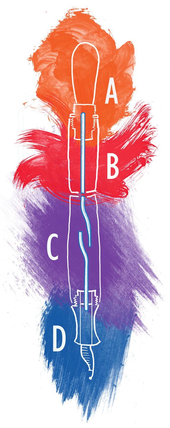
Enough now about the origin of this pen and on to the most interesting facet which is the filling system. This is the most complex bulb-filling system I’ve seen in person or in books. It’s usually a simple system not taken to an extreme like this and I’ve put together a little diagram help me explain the major sections of it (click it for a larger version):
 The A section of the illustration is the rubber bulb itself. Pressing and releasing the bulb creates the pressure and vacuum that fills the pen. This fits through and then wraps under a collar which screws into the barrel. The threads for the blind cap are also here.
The B section is an area that I will call the vacuum chamber for no other reason then I have to call it something. The tube that enters this chamber from below allows for the air flow but also keeps this chamber dry. You can see the tube goes quite a ways up so no fluid will be able to get past it and into here theoretically. I don’t know if there is a benefit to this other than the bulb stays ink free so leaking from it would not be possible.
The C section is the ink chamber. There is a divider in the barrel between this and the previous chamber where two tubes come together. Air is evacuated through these and then out the tube connected to the section due to pressure from the bulb. Ink will then flow back through the section tube (if dipped into the bottle) due to the vacuum created by the release of the bulb. Repeat this action until the pen is filled. The height of this section tube marks the upper limit of the ink level in the chamber which it just about to the top. The reason the upper tube in this chamber hugs the side of barrel at the far end is a mystery to me. Possibly they felt that capillary action would pull any ink that got into this tube out again?
The D section is the nib, feed, and section of the pen.
How well does this filling system work? Well, I’m not going to fill this pen despite my usual lack of reluctance to using NOS or rare-ish pens. I have no idea how many of these are left and I like looking at it empty and clear. Using water I can tell you that the upper chamber can get liquid in it if you are over enthusiastic with your filling which would not be a good thing since it has no place to exit from up there. The system’s all a bit silly really. The rest of the pen should function normally since it has a standard construction.
So now you’ve seen this bit of history too and I hope you found it interesting. There’s always something out there that can befuddle and confound it seems.

I’ve got a quick follow-up on my last post about the Hicks-Sackett pen. The long “feeding stem” was missing from the pen when it arrived. Not surprising since it seemed the weakest part of the design being made of hard rubber and spindly. Somewhere in the past an owner was a bit rough refilling the pen and it snapped off. Besides acting as an ersatz feed that piece also seemed to provide a bit of locating support for the nib/feed plug. What I tried to do was construct a replacement using stone knives and bearskins which are about as advanced as my tools get. In the end I had a main shaft and a smaller hard rubber feed on top that ran down about 1/2 the length. Not perfect but workmanlike.

Mr. George H. Sackett designed a pretty poor pen. Of course that sounds harsh a 124 years after the fact, but I’ve been examining the results of his fertile imagination and have come to that conclusion. Before discussing this curiosity more let me say I can’t blame him too much since early fountain pens are odd beasts as inventors and companies in the early days tried to morph them from glorified dip pens with a built in ink supplies to dependable instruments which would not alter your finger color. It was a free-for-all at the time since it was easy for someone to take a tube, stick a nib on the end, and engineer what was between based on simple physics and bizarre notions.

I’m not sure if back then people thought building the perfect fountain pen would have the world beating a path to their door but it seems so. Type the word “Fountain Pen” into the Google patent databases and you’ll see enough listings to bug out your eyes. We tend to think the implement we nib fanciers use is a proven mechanical device and focus on aesthetics or usability but these early patents are an indicator how long the development process took. Nozzles, tubes, valves, and other tiny internal workings are intricately drafted in the old records and illustrate the inventor’s genius or insanity. Time and time again great self-assurance shines through in the pages and pages of descriptions and diagrams that are found.
The designer of the pen in question, Mr. Sackett, had at least three patents for a fountain pen (here, here and here) which show seemingly the same construction. Why the individual patents were filed and granted (just months apart in 1886) is confusing. The last tidbit is that an advertisement for this pen listed an 1885 patent but I can’t find it. This muddle aside it does seem there was little time wasted before manufacturing started since ads can be found from 1885. I’m neither a good researcher nor a patent expert so I can offer no explanations for all this. I’ll chalk it up to something unfathomable from the distant past which is another way of me saying I didn’t bother any further with the mystery.
Who was the inventor? Thanks to a family history I did find out a few factual items. His entry read as below:
GEORGE HENRY SACKETT, 1826-, of Providence, R. I., and Brooklyn, N. Y., son of Isaac and Mary Johnson Sackett, was married at Providence, R. I., July 27, 1857, to SARAH SWEETSER SHELDON. He was, from 1855 to 1878, a member of the firm of Sackett, Davis & Co., jewelry manufacturers, of Providence, R. I., and is the inventor of the Sackett fountain pen.
As you can see Mr. Sackett’s eponymous pen was considered an important enough achievement to be listed as one of his two accomplishments.
In that biographical tidbit it’s interesting to see that he was jeweler like many people involved in the nascent fountain pen industry. His invention seemingly got him out that business and by 1890 the Sackett Fountain Pen Co was located at 169 & 171 Broadway in New York City – at the corner with Maiden Lane, which was a hub for Jewelers in the city as well as many writing instrument companies as Waterman’s and Mabie, Todd & Co. One of the companies neighboring the location was the William S. Hicks Company which sold fountain pens both under its own name and for such high end establishments as Tiffany’s and Cartier. Many of these were beautiful, expensive pens and pencils made from precious metals and are prized today.
I’ve not found when or why Sackett and Hicks got together to brand and sell the pen designed by the former. Advertisements from the beginning list the pen as the “Hicks-Sackett”. Being an older and more established firm Hicks could have offered manufacturing capabilities and a proven distribution channel which must have been appealing. The elder firm may have wished for a low cost line of pens to market and latched upon this design as the one that fit the bill. Either way the pens were made from around the patent date till at least late into the first decade of the 20th century. By the late oughts the pen was quite a dinosaur since its competitors had invaluable features as modern channeled feeds to regulate ink flow and combs to catch excess ink. Add the use of screw caps and self-filling systems in some marketed pens and – even at a low price – the Hicks-Sackett pen was a doddering holdover from an earlier era.
The following might be dry, boring, and maybe even confusing in describing how this oddball pen works and includes illustrations that may make you squint and get a headache. With that caveat lets look at the pen parts and the basic principles of how they function. The first image below is from the patent that is best represents the actual pen sold. The second scan is a detailed illustration from an advertisement that also backs up that claim.


Externally it’s unremarkable except for probably the first thing you’ll notice: The slip cap has a smaller diameter “crown” on the end. In my opinion this is the cleverest feature of the pen since the protrusion into a hole on the opposite end to allow posting. It’s a nice, tight fit and there’s no chance of a ring around the barrel ever forming from the friction of a cap being placed over it.
Internally what you see illustrates its origins in the late 19th century when fountain pens were in their infancy. As stated earlier the Hicks-Sackett is without the later innovations which made pens reliable and predictable in use and throughout the long period it was manufactured was frozen like this. In a nutshell it is basically a chased thin black hard rubber tube with an odd feed rod inside and flat triangular bit acting as a rudimentary feed.
The most prominent part that extends inside the barrel front to back is the “feeding stem”. This long grooved bar looks like a narrow feed on steroids but the patent text tells you the reason for it is to transmit the last bit of ink clinging to the walls of the pen to the nib via capillary action. That’s a reason but a silly one indeed. As seen in some of the Hicks-Sackett advertisements in the gallery below using the last drops of ink was brag worthy and for some reason the period around the turn of the 19th century was one where pen manufacturers fretted about this ability in their products. If you look at how pens like the Parker “Lucky Curve” touted their ink evacuation ability it seems like this was something the masses were demanding. From the hyperbole of the advertisements violent mobs must have gathered to chant “No ink left behind!” Of course this was just a marketing ploy since everyone wanted their pen to stand out in some way and this was flashier than saying “our cap stays on!” or “the pen that makes lines on paper!” The entire idea seems to have been abandoned as other things could be patented and harped upon like filling methods or interchangeable nibs. History shows people were alright with refilling their pens prior to that last drop being used since later pens phased out the gimmicks that were supposed to throttle the last of the ink out.
So the snake-like “feeding stem” which was inside the pen got a lot of thought. Unluckily nothing much else seems to have, especially the feed. Many contemporary pens had an over and under feed in the Hicks heyday and one could justify how elaborate these were since the super flexible nibs of the time needs a ink to gush down to where the rubber (read nib) met the road (nee paper). The Hicks-Sackett didn’t even bother with the underfeed that is still currently used in fountain pens and instead has a triangular sliver of hard rubber above the nib which has a standoff to make a gap which pulls ink out via capillary action. What is desperately missed is something like feed groves to allow air back up into the reservoir to fill the void ink leaves behind in a metered fashion. Everything happens on this pen through the same tiny slit behind the nib which the patent gobbled gook says will work just awesomely. In reality it allows air and ink enter an exit willy-nilly resulting in the occasional glob of ink coming out when air rushes through too fast. Aesthetically I love the way the nib looks – like a dip pen’s from underneath but that doesn’t compensate for the poor functionality.


My criticisms wouldn’t hold water with the copy writers who created the ads for the pen as profuse praise was heaped upon by them. What kind of drugs they were on as they wrote these I don’t know, but one claim is that you will not get your fingers inky when refilling it. Possibly they had soot blackened fingers (Dickensian image) so they never noticed this pen almost guarantees ink stained digits. There is no section at the front and the barrel just continues jauntily on till it comes to an abrupt end. Here the feed and nib is held in place by a plug that friction fits into the hollow of the inside void. Removing it means you have to grasp the feed and nib between your finger and thumb and you know what liquid is on them? Yes, ink.
None-the-less the ads I dug up for this pen are a fun romp through a time long past. Look at the hyperbole in them for a quick giggle. I’ve found as many as I can so you can see that the pen never altered over its marketing life. If you do see these and wish to go back in time to purchase I recommend you first look at a certain new pen by a Mr. Sheaffer he calls a “lever filler”. I also heard Mr. Waterman makes a fine product too.


What I love the most about researching this pen was finding the original patents and taking in their lovely language. On both you see Mr. Sackett tried to cover as many bases as possible by explaining alternative ways of executing his design. I have to say you can almost buy that this pen will revolutionize the field as the grandiosity of the design is teased out for you. If it only had a tiny steam engine and flapping wings you could see this as a prop in some modern steampunk fiction and called “Dr. Hermes’ Incredible Levitating Ink Fountain Marking Machine”.
The Hicks-Sackett pen is fascinating, odd, frustrating, and wonderful to explore. Some questions remain like why Hicks was associated with this pen and how it continued to be sold when as it become so inferior to its competition. But I’ll not trouble myself with that since I am not a historian but an observer. The pen that is pictured in this post has been passed to its new owner who has used it in part to create the wonderful illustration below. This proves that talent trumps technology – or something like that.


It’s obvious that old pens don’t work as well as newer ones. Take a look at the first fountain pens to be produced and how poor the ink delivery was due to feeds like tongue depressors. Like with any technology it takes a while to reach perfection. Another factor in early pens was that flexible nibs need a lot of ink to make those wide lines when the nib is under pressure. So in the late 19th century you wound up using a pen that would give you a nice ink blob in the middle of a word.
Various methods were attempted to make the better mouse…er…pen trap including some which were half or quarter baked. What is called an “overfeed” was effective enough to have lasted on some pens like Onotos and Swans for nearly 20 years. I won’t go into great detail but what the overfeed does is the same as the underfeed: ink saunters down it to the point from the reservoir. This gives it a double dose of inky goodness needed by super flex nibs.

I have a great example of this type of setup in an export Swan slip-cap eyedropper you see above. Why I say “export” is that this was sold in France where legally calling something “gold” meant that it had to be 18kt or above in quality. When I removed this nib I saw the text verifying this as well as the word “broad”. I think this is more a stub nib than a broad and with its flex is quite a joy to use.

If you want to see the few parts that go into this simple pen take a gander it during cleaning and restoration. There’s a barrel, a feed, a plug with wire retainer, a nib, the overfeed, and the cap. It’s such a graceful pen in how few bits make it up. Plugs go into holes and in this case it’s an alternative way to fill the pen. You can pull the plug (the Swan will not keel over) and use an eyedropper in that spot. The only confusing thing you might see is the modern addition of an o-ring on the section to seal it better.

Another interesting fact is that this is an American made Swan. The company that made Swan and other model fountain pens, Mabie Todd & Bard (just Mabie Todd in later years), goes back to the mid-19th century making dip pens and pencils. By the turn of the century they had been making fountain pens for a while and started a British subsidiary. That UK arm really took off and their product was a success while the U.S. sales slowly dropped. The single company became two and parted ways. The U.S. firm closed up shop in the late 1930s while the other advertised itself as “The Pen of the British Empire”.
I’ve never quite seen a pen that can put down a line as wide as this pen does when flexed. When ink runs out in these instances you get “railroad tracks” or a double line since there’s not enough ink to fill the center. So, one can see the odd feed is doing the job. Yay for old tech!

Everyone loves cheap and cheerful. Who doesn’t want to get something fun for very little money? OK, so maybe the filthy rich don’t care but for me when I see something new, cool, and affordable I’m all over it. Of course the results are a lot of junk I’ve used one time or less sitting about but that’s the way it goes for those of us with impulse buying syndrome (IBS). Sure, that tiny battery operated egg whipper looked so cool in the package but when you realize what it gives eggs is more like a lashing you find a spot in the junk drawer for it. There it lives until the bi or tri-annual household junk cleansing where, if lucky, your embarrassment goes into the charity box with the unit.
Since I collect fountain pens I was thrilled to see an announcement form JetPens that they would be selling some writing instruments that fall into this category. Now let me state here that I still think the best value in fountain pens remains restored or NOS vintage models. Often the less sought after can be had for only a few dollars (Sheaffer’s NoNonsense line for example) or tens of dollars (Sheaffer’s mid-market pens from the 60s) and they are usually made to higher standards than you’ll find in cheap pens today. When I saw that the new Noodler’s fountain pens were ready to ship I couldn’t help myself and picked up a few. I also received a few extra purchased by friends in faraway places so after delivery I am swimming in Noodler’s pens which makes it good time to review them.

If you don’t know what Noodler’s is I’ll give you a quick summary here: Nathan Tardiff was well known a dozen years or so ago when I got into fountain pens in a big way. Considered a knowledgeable collector and ace repair person I even bought a pen or two from him. In recent years he started a line of well-respected and innovative (and sometimes controversial) inks. Noodler’s inks give you a huge color range and a good value which I don’t think anyone can dispute. Expanding his range he is now offering two models of fountain pens.
The first and lower priced line is a piston filler in a range of plastic colors with a screw cap. It’s a basic design that reminds me of German school pens of the 60s and 70s. The other is an aerometric filler in hard rubber with a slip cap. These pens come in your choice of green mottled and brown mottled. The design has tapered ends somewhat like a vintage Sheaffer Balance. This pen also has a gasket on the section so it can be converted into an eyedropper filler if you wish.
Both pens are made well enough for their price point. The plastic one has a very simple piston design which is workable and it feels solid in hand. The most noticeable exterior feature are ink view windows which are sized right to be handy. Both models have the same style nibs which are called fine-medium like they have an identity crisis. The price point is “cheap” so don’t expect jewel like details. The trim and fittings are sturdy but nothing more. The plastic on the piston filler shows changes in color where the dye must have changed concentration. The tip which retains the clip on the hard rubber model is very small in diameter giving it a “dunce cap” look. I’m happy to see a silicon sac is used in the aerometric filling system which is nice since you can see the ink level.

Where the ink meets the paper you have a steel nib that is functional and smooth enough. The feed is a hard rubber comb variety which is basically the same thing you’d see on a pen from the 1930s and so is reliable and simple.
As I said you get your money’s worth but don’t expect any surprise and delight. While not a piston filler the Pilot 78g is noticeably higher quality if you want a peer comparison. Noodler’s Hard rubber pen, however, seems to have no competitor at its price. Still for about 1/3 more you can get one of Steve Braun’s Varuna fountain pens that are eye-droppers only but heftier, more solid and expensive feeling.
Using either Noodler’s model is simplicity in itself. Turn the knob and the piston filler fills. On the aerometric pen you compress the sac a few times. Both work flawlessly. There is a bit of effort in converting the hard rubber aero pen to eyedropper but it’s not rocket science. You remove the sac cage and the sac and that is It since the previously mentioned seal is already there to make it water tight.
I’ve been asked a few times what I think of these pens since I got them the other day because the attractive price is a draw. My major remark is they are honest and a bit unusual pens for this price point and certainly will be entertaining.
One claim to fame for these pens is that the nib and feed can be pulled out since they are friction fit. Why do that you ask? Well, if you have a #2 vintage nib lying about you could stick that into your pen and voila! A whole new writing experience! Technically a stub, italic, or even flex nib could be fitted if you wish a change. In reality there are some problems since not every #2 nib is the same nor even usable in these pens. The major issue is that the steel nibs from the factory are rather thick in cross-section and vintage nibs seem for the most part thinner. This is especially true of nibs that have some flex. What you wind up with often is a lose nib pushed way back into the section to get some purchase. This isn’t acceptable for me. I did find a few nibs that fit better but were more a #3 size so that’s something to keep in mind.

So far I’ve seen a few complaints about these pens from new owners. Most seem to be lapses in QC like crooked nibs or sections getting stuck when being screwed. The thin and weak product boxes don’t help since they offer little protection so when shipped caps can fall off and pens can work lose. Crushing is certainly a possibility as well. Time will tell if some of these problems are just teething pains.
A friend joked that I should have a rating system for pens and we came up with the “double rainbow” system. It goes in half-rainbow increments from 0 (the lowest grade, equivalent to writing with a rusty nail dipped in beet juice) to 2 (the highest rating which is like a sweet flex nib Sheaffer). These pens would be a 1 rainbow from me because while unremarkable do give you value for what little you spend. Still I won’t recommend these and will suggest a Pilot or slightly more expensive modern pen, such as a Lamy, to those seeking entry level fountain pens due to some spotty QC issues. If you must have a piston or hard rubber pen I’d say look for inexpensive NOS or restored pens of this type. My Lamy 27 (piston filler) is far, far superior in construction and feel than the Noodler’s and with some looking not that more expensive.
