When a friend sent a link to show me a desired calligraphy pen at an online vendor I was impressed that a place with such a large stock of this specialized merchandise existed. A second surprise happened when I looked at this stores contact information and I found they were located in the city I work in. A few days later I trekked there for a look in person.
I didn’t know if they had an actual storefront so before going I checked and found reference to some clearance books being “next to the door”. That’s all I needed to see since where there’s a door there is a way in. I’ve not seen the door that can keep me out yet (unless it is locked or heavy or had a confusing latch that I couldn’t make work)!
John Neal, Bookseller does sell books on drawing, calligraphy, typography, bookbinding, and more. Beyond that they carry the things you need for binding your own books and creating lovely lettering. All this is packed into a small, funky warehouse like environment that zigzags through the first floor of an old commercial building. It’s not really a “store” so to speak but they still let customers wander around and look. I had fun pulling books off of the shelves in the narrow nooks and the staff was friendly and helpful.
It’s probably more convenient to order off their web site and you are not missing out on any memorable retail experience but seeing a small, hospitable business firsthand at least made me happy. I took a few quick snapshots to share the experience and the claustrophobia with you.
I’m finally getting back to writing about pens, a topic I find interesting even if that may indicate a psychological abnormality. A number of things have been sitting around waiting to be introduced here but without a common theme to link them. If pressed I can say all the pens do happen to have good points, and I mean that literally.
First up is something cool due to its obscurity. The doo-dad maker Levenger sells a lot of fountain pens and sometimes contracts with manufacturers to make special editions for them. Somewhere around 10 years ago they had the Italian firm Omas make a nice medium sized piston filling fountain pen called the Articula. Not a big deal in itself but the hook with this pen was that it had a flexible nib. Of course a modern flexible nib is only semi-flexible in comparison to those from the days of yore and this is no exception. Nonetheless the nib is comfy to use and can be coaxed into an expressive mood. I’m not sure why this wasn’t a more popular pen considering all this.
Nibs in a row: Sheaffer, Parker, and Omas.
It’s hard to find a Parker Vacumatic with a nib that isn’t narrow but they exist and I had such in the form of disembodied Canadian made stub. Never wanting such a nifty nib to go to waste I put it on a circa 1940 standard size Vac I had recently purchased as part of a lot. Even more frightening was this Frankenpen was already equipped with the wrong filling unit in the form of an earlier lock down version instead of the proper aluminum speedline. The result is actually not scary but a nice writing mish-mash with lots of character.
The final pen is a Sheaffer’s Thin Model also equipped with a stub. A damaged barrel on the original required a replacement which turned out to be green creating an overall effect is a bit like a classic Pelikan (one of my favorite color combinations.) The modest stub nib writes smoothly and like the Parker discussed previously isn’t something you see every day.
Pens and Pooper. Thanks to Hazel for the pen wrap underneath. (click for closeup)
You have to have some paper to use a pen with and I got lucky enough to find something a few weeks ago both fun and environmentally sound. On a visit to Office Max I saw a few boxes of Terracycle recycled paper on closeout. What makes this cool is that we’re not talking paper made from post-consumer waste but made from some out of the ordinary items. The sample pack I have uses grass, banana peels and pachyderm excrement to make the sheets. Yes, you heard me: elephant poop.
All three papers are moderately rough in texture but very attractive with some unbleached elements appearing randomy. They are also very fountain pen friendly exhibiting no bleed or feathering. Sadly the reason I saw this was because it is no longer made and can’t be found at the chain anymore. However, if you search the web you will find other places that still market papers like this, even the poopy one.
And on that note I think it is a good time to end this post.
A hasty trip by air and auto took me away last weekend. By my standards having a little over a week to plan a trip is hasty, especially if you are going to New York City. Two things presented themselves to make me consider such a trek: A father who seemed to be feeling better than ever and his new car.
My father has had a few years of ill health (and all the baggage being a wee bit of a hypochondriac can add to that) so when some medical tweaks suddenly made him regain some vigor I was impressed. Since my father is at his craziest when in high spirits his purchase of a Porsche was only modestly shocking. Certainly at his age he should do whatever makes him happy and I’m all for indiscriminate spending on fun things, after all look what I collect! These events were a sign that it was time to get my father out and about doing something fun and far away after such a long period of him protesting he couldn’t.
Even though the weekend after Thanksgiving was very close the free from work Friday made the time ideal for this road trip and I went about quickly (OK, I procrastinated) making plans for it. Soon I found myself flying into Buffalo, NY and taking the wheel to move on down the road for 7 hours into the heart of Manhattan. It wasn’t all bliss, though. The expensive SUV didn’t have an iPod aux jack even though the cheapest Kia comes with such gratis. A few hours of driving and I was looking (and looking and looking) for a decent book on CD at Cracker Barrel to fill time on the boring concrete ribbon of the interstate. Learning to use the complex interface for the rather misguided navigation system also tried my patience. It worked like the partially decommissioned HAL did in near the end of 2001 a space odyssey and I was surprised it didn’t start singing “Daisy” somewhere in New Jersey.
Miraculously we made it to our Midtown hotel only to find our room was not ready yet. Actually, It wasn’t ready for two hours which normally would have perturbed me if it wasn’t for the fact that I got comped free stuff every time I went to the desk to ask “ready yet?” In the end through judicious choice of a different receptionist every time I went up to put forth my inquiry I had accumulated 10 free breakfasts and 4 slips for drinks at the bar. That was 4 more breakfasts than we needed for our 3 day stay but they started being distributed en masse towards the end of my pilgrimage to bug them.
The goals for the weekend fell into two general categories: Things with my father and things without my father. The latter was intended to help me keep my sanity over this period. The former included eating and the opera which was the point for coming to the city and we certainly had a good deal of both.
The Opera was Il Trittico by Giacomo Puccini and I was astounded by the stage presentation and voices presented by the Metropolitan Opera. It was long but that was justified by the final of the three single act operas called Gianni Schicchi. This was a very funny comic opera that won the heart of this most ambivalent opera listener. My father loved it all and even made a friend in an old woman who I found him discussing Czechoslovakia with when I returned from intermission. Below are some images of the event for you to take a gander at. The sets and stagecraft utilized for this were incredible and even utilized some tricks of perception to make the stage seem deeper than in actuality. Yes, I did put a tie on for the event which I felt was appropriate even if I’m not sure I didn’t look a bit like a tourist.
My father is a fine person but he has weird outbursts of angry old man at times. I’m pretty good at putting my hand over his mouth when this happens but my biggest challenge was to keep him from getting into trouble. In the end I am happy to say only 4 times did I cringe in either embarrassment or shock. At the opera he grumped at someone who got in front of him in the elevator which is par for the course. After the performance when cabs were scarce he wanted me to take proactive physical action to obtain a cab before others who had seniority. I will say here that he has some trouble walking and didn’t like standing around but I have two strikes against me in cab warfare: I’m polite and I’m rather small. Lastly, there was his outburst at a hostess at a German restaurant we ate at and how his inexplicable insertion of his hand in another person’s waiting food. I’m not even going to give details about that little incident.
Around all the other activities I did get to eat (and eat). One of my favorite restaurants is Les Halles whose executive chef once was Antony Bourdain. I go there for the boudin noir which in English has the less romantic name of blood sausage. Certainly not something you’ll find at the local IHOP but totally tasty if you can get beyond the ingredient in its name. Some giant German sausages at the Heidelberg, a prickly pear margarita at Dos Caminos, and some great Belgian beer at the BXL Café got worked into the trip as well. However, the only pictures of my general wanderings are of the environs of Rockefeller center. It was lovely as usual and the big tree was…well…big.
So, that takes care of the boring part of this all. Now I can talk about one of my favorite topics: pens and friends. I made a beeline Saturday morning for Art Brown International Pen Store which is a great place if you are of the pen, stationary, and ink mindset. An enjoyable time for me is wandering and ogling the contents of such a place, as you can imagine. I was picking up a few presents and some other items when I came across bottles of the now discontinued Montblanc Racing Green ink. I bought a bottle since it was low priced and now seemingly rare. I’m only mentioning this since I think I’m going to give it away on this blog in the near future.
Sunday saw me off on my own to visit MOMA. I wanted to see the Tim Burton art exhibit being shown but found after getting my tickets that you were assigned to a time slot when they would let you see it. Of course that time was 3 or so hours later than the when I arrived so I never got to view it. Still, all was not lost as I got to see a really fabulous exhibit on the Bauhaus school in prewar Germany.
After my fill of Deutsch modernism I had a terrific lunch with Dominique James, a pen friend. He is one of the original members of the Fountain Pen Network-Philippines group which I’ve blogged about before. Since I’m a distant acquaintance of a couple FPN-P members I’ve known that he lived in NYC and thought I’d see if he might want to meet up. I’m always stunned that someone would be nice enough to spend their valuable time with me but he agreed. The lunch was very enjoyable with much talk about pens interspersed with some interesting information on the Philippines and cooking. I stayed longer than anticipated so I was off in a rush to my next appointment.
Two people willing to see me in one day doesn’t come along too often so I hustled uptown to the Columbia University area. There another wonderful person who I knew from online interaction, but never met in person, waited. I, of course, was quite late to meet her and which got me off on the “now you look like a dimwit” foot. Mia was far nicer than I had a right to expect and my tardiness was overlooked. I got a highly enjoyable tour of the local neighborhood and a few places of sustenance. Food makes me docile and easily led so it was a good thing that I had great crepes for a pre-dinner snack followed by some wonderful croissants from a local French bakery. After the tour and picture taking I had an experience which reminded me of being on a childhood play date with a friend. We spread out pens, pads, and inks and spend time trying it all out. It ended way too soon as I had to go to dinner with my father who had spent a great deal of time watching football that day (yes, that’s my father). I left taking with me the two best tamales I ever had.
While on that neighborhood walking tour I did get to see a fascinating Church and fountain. The Cathedral of St. John the Divine is very imposing and creepily gothic. In the gardens next to it is both the oddest and most interesting fountains I’ve ever seen. The Peace Fountain has a depiction of the battle of good and evil which contains (among other things) a giant crab, the sun, and an Angel. Not sure how to fathom what kind of aquatic/solar/heavenly battle is going on but it’s dramatic. Even more surprising was the albino peacock that wandered behind a fence on the grounds. That was the last thing I expected to see in New York City.
I think both my father and myself had a great trip to that little, sparsely populated island city. I’m hoping to get back again at least to check out more stationary stores and maybe catch another opera to try and stay awake during.
The idea that effort can be saved by gathering tasks together to tackle as a single unit is not something that originated with me. Being both lazy and a procrastinator I find myself afloat in a sea of topics and items I wanted to write about but never got around to. Thus I’m applying that principle here in this stitched together post that I hope will intertwine some ink, paper, and pen items sitting around here.
Pen
I single-mindedly comb the world for Sheaffer Snorkels with interesting nibs. My day races by with me obsessively hunched over a monitor, a phone in my hand, utilizing a chip in my cerebral cortex that gives me a direct uplink to the Internet. OK, most of that isn’t true but I do look more often than the average person to see if I can find something cool.
A little while ago I got lucky and found myself a pretty good deal on a Sheaffer Snorkel with a traditional open nib. Not a run-of-the-mill example this had the FM3 marked nib (medium point flexible). These are hard to find (proverbial hens teeth, needle in a haystack, or bit of food a pug won’t eat rare) and when I was the happy owner the bill came to an astounding $22. Lucky? No…it was skill! OK, I got lucky. I thought I was the Baron of Penfindia until a friend found something similar for $11. Descent from smugness is sometimes so rapid you skin your knees.
What is odd is that this nib has less flex and a slightly narrower line than the other FM3 nib I have. It’s still flexible but not as giving as the predecessor nib in my collection. I have a feeling these specialty nibs were more handwork than the vast quantities of fine and medium nibs turned out by Sheaffer and that might explain such variances. Once I did get this pen restored I filled it with Private Reserve Supershow Blue ink and happily doodled away on the next topic of this post.
The $22 flexible Snorkel.
Paper
Once again Karen at Exaclair was nice enough to send me a few things to give my hasty and subjective opinions on. One of them was a pad of G. Lalo Vergé de France white paper. I’m used to using the smooth Clairefontaine paper when I need something to make ink form shapes on so this was a nice change. This is laid paper and the factors you immediately notice with this substrate (otherwise known as fancy-schmancy stationary) is it has visible watermarks, a bit of a tooth, and a substantial heft.
What is laid paper? Well, making paper is a lot more complex than most people think. It’s not just like you chop down a tree or mash up some recycling and you have a sheet of the white stuff. There are a number of steps that takes the raw materials through slurry, gets it flat, and then smoothes and dries it. The end product differs depending on the way these procedures are done. The part that we need to look at involves what is called a screen which is for capturing the pulp slurry creating a thin skin and allowing water to drain out of it. As the fibers rest they take on any pattern that is held in the screen like a watermark, for example. Most modern paper is made on a screen of a fine mesh of filaments and imparts a uniform, opaque look to the paper (except for the aforementioned water marks). Laid paper is a more old fashioned method where the screen is made of parallel filaments and the final product shows a ribbed texture when light passes through it.
I like laid finish quite a bit and in fact the boarder around this blog is my scan of some Crane laid note sheets I had on hand. The pattern in the fiber seems to enhance the paper’s attractiveness because it creates visual interest. Writing on this paper is a different experience from my typical papers since while not extremely rough you do feel the nibs contact on the sheet more. The act of writing somehow feels more formal and special. When I use it I feel all my words are profound and meaningful even though in reality they are incoherent scribbles that I don’t understand a few hours hence.
Specifically the Vergé paper is excellent in all areas. It’s 100gsm with 25% cotton fiber content so isn’t lightweight and shows almost no feathering. At first I thought there was bleed through on the paper but I quickly realized that these sheets are quite translucent and it what was written on the sheets could be seen as light passed through. When placed face down on a table it was less noticeable. That’s not a problem for me and since there are a number of available colors it might not be the case with those. Click on the images below for further enlightenment (or just boredom).
Along with the paper came ink I’ve been wanting to try for a long time. I like black inks but I hate ones that aren’t dark, dark, dark. Also some seem to have a reddish-brown cast on the edges that I really don’t like. I certainly have not tried every black out there but there have been a few on my desk over the years. Knowing that some of the J. Herbin colors aren’t too saturated I wondered how the Perle Noire that arrived would perform. Happily I can report that it is a nice opaque dark black that I’ve not noticed any negatives to yet. There are a lot of black ink comparison reviews in blogland that are quite thorough so I’d recommend taking a look since this is just a quick impression.
Pugless
So we come to the end of my omnibus post. There’s a still a lot of items I need to get to but at least I’ve removed a few from my list. The pugs wonder why they aren’t pictured in this post due to the growing number of fans they seem to have. Maybe next time I’ll see what input they might have but for now the puga donnas will just have to keep snoring.
OK, I gave in. Here’s Mr. Puggy’s reaction to the Snorkel. He tells me it’s beneath his notice.
Not too long ago Karen at Exaclair sent me a Quo Vadis Habana notebook to use and, if inclined, relate my thoughts on it. A few words about them before I get any further: Via their blogs, tweets, and other social media presence this company has proven itself to really care about its customers and their feedback. No, I’m not just saying that because I want another notebook. How could you even think that about me? Humph.
I must admit that I was pretty sure how this review would go before I sat down to write it. The Habana notebook pictured uses Clairefontaine paper in it which has been my favorite for years. The paper is smooth to write upon and, important to us fountain pen users, bleed and feather resistant.
The problem was I’m a procrastinator and I didn’t get to writing this entry until just about everyone had already reviewed this notebook doing a much better job of it than I could (like my friend Clem did here). Realizing I needed to come up with a different way to review the notebook, as to not tread over the same old ground, I sat and did my best approximation of thinking. Obviously I needed to push the envelope and do something different, new, and never attempted before. I had to drop the usual paper quality, ink penetration, and binding construction stuff for new frontiers.
Well, if I’m not reviewing the Habana on how it works traditionally as a notebook then what should this newly-styled iconoclast do? Thinking “push that envelope” led me to decide to see how the notebook worked in ways that people not as cutting edge as myself would think of.
At this time from behind me came the loud and rhythmic noises of the dog breed often called the “furry boulders that snore”. That seemed as good a place as any to go for my unique take on this review. However, as you can see, the Habana Pug Pillow didn’t meet with the approval of Snuffy, pug stationary tester. Also it was hard to clean drool off of. Back to the drawing board!
Snuffy did not approve of the Habana as pillow.
I made a nice, hot cup of tea to sip on as I thought more. Suddenly I had a flash! It was my tongue burning form the hot tea! A few medicinal ice cubes later I really had an idea as you can see below.
Covers flopping open made the Habana tea tray awkward.
Alas, the Habana Tea Tray was not roomy enough to use and got soggy when tea was spilled. Back to square one.
Liking the utilitarian track I was following my next brainstorm was so simple it bordered on not being stupid! Here’s something I could get a lot of mileage out of in my review: the Habana Window Prop! Oh yea, I would go on about how great this was for holding my windows open, creating ventilation and the like. No one has even come close to mentioning that in a review! This was sweet!
The Habana window prop had problems on rainy days.
The major failing here is that we’ve had rain for two days straight now. Remember the soggy comment a little while ago? Unluckily I realized it was time to move on once again.
The idea that there might be a productive, non-traditional twist on this all drove me to go deep, deep into the genius that is my mind. Well, deep is relative and I think shallow genius ain’t nothing to sneeze at. After all, an ant thinks a puddle is an ocean! Sadly, and predictably, this feverish activity went nowhere. I needed to take my mind off of all this and so went about repairing things I had broken trying to repair them earlier. It was while at this another eureka moment occurred!
I never got a clean cut with the Habana saw.
Well, Habana Saw didn’t work out and the bias-cut it made was just awful. I guess I shouldn’t have hitched my philosophy to ants.
I wrote off the idea of finding some use for the Habana and went the opposite direction: totally useless. Being quite the expert at that idea flooded in. Happily that idea had to do with how attractive the basic black Habana was so certainly it should be where people could see it… maybe if I move that vase over there we might have something.
It didn't really work as an objet d'art.
The Display Only Habana just never really *merged* with the décor and caused people make comments like “where’s your vase” and “why the hell do you have a notebook here”. Not an astounding success.
So, I gave up and went back to what I wanted to avoid: a typical review. I will make this brief so you can escape from here quickly. The Quo Vadis Habana has a number of features I do like very much. First is the Calirfontain paper which is the usual high quality, bright, smooth substrate you find in items branded under that name. As always this paper is a fountain pen’s friend with only the slightest feathering and bleed thorough.
The look and feel of the cover on this notebook is quality. It’s soft but firm with the logo embossed on the front and the name on the back. A pocket is on the inside back cover which is very handy when you have receipts in your pocket taking up space but you can’t see anywhere to throw them out. The elastic band that holds it all together is pretty standard as is the ribbon that marks your current page.
The binding is quite interesting in that the spin is very soft and flexible. Most of the back of the book block isn’t glued to the sine so it can lay pretty flat. I did notice that one end did have the spine glued down but only in a small area. I think this is where the ribbon is attached. No matter, this is a nice book to open and spread apart.
The images below show how it reacted to my little writing test so click on them to see the big picture.
The size is larger than what I’m used to but I do like the extra real estate. It will fit into my backpack easily and when on your lap for notes offers a more stable platform for writing.
In the end I’m a fan of this notebook and happy to have gotten a chance to see what it can do if motivated to be all that it can be. I don’t see many negatives other than the ribbon can fray a bit and you can’t use it as a frying pan (that experiment I didn’t document due to the fire.) Although I keep calling it the “Havana” by accident it’s certainly straight forward in all other ways. Just remember it works best as a notebook.
This is another post about gifts that generous and (way too) nice people have taken the time and effort to give me. I have no idea why they bother to do so since as previously mentioned I’m just a distant curmudgeon who doesn’t really merit it. Still they gleefully ignore that completely and send things through my force field of grumps.
Well, some things are an open book. Notice the red ribbon.
A long time ago in a galaxy far, far away I took some bindery courses and actually bound a few books by hand (I’ve still got some). I know that this takes more art than science to wind up with results that are attractive as well as useful. Mona is a person that that can craft journals and other bound items of great beauty. She sent me the one below which I’m indebted to her for. The amazing thing is she just started doing this not very long ago. It’s a sideline to her other hobbies like knitting and fountain pen mania but I’m certainly happy she took it up.
A lovely Mona brand journal
My work hasn’t taken me far afield in quite some time but my friend Caloy’s livelihood takes him places I’ve both dreamt about and only vaguely familiar with. Dhaka, the capital of Bangladesh, is the latter. At a conference there recently he picked up a locally crafted embroidered pouch for me. It’s the perfect size to hold the stack of postcards I keep and the postage for them. It’s also strikingly attractive.
Perfect for postcards.
I never know how to receive a token of friendship in person so I usually fidgit and make some inane quip about how someone else would be more worthy of the item. Use your imagination and insert that image here.
When taking these pictures I saw this. Reinforces my hatred of geese.
Until this year I don’t think I ever mailed a postcard. It’s not like I was unaware of them since over time I saw them so often in various places like tourist traps at Niagara Falls, state park welcome centers, and airport gift shops that I grew to treat them as a part of the background. A few months ago through the auspices of some friends I learned that in the internet age they are still alive and kicking even if reduced in popularity.
Getting told while chatting that someone “got a postcard from…” was my first reminder of the venerable card stock rectangles. The story involves a person who lives a very long way from me and was very excited to get this item from someone who lived a very long way from her. It took days and days to arrive, carried very little information due to space considerations, cost a moderate sum to send, and in all ways was inferior than just typing on your keyboard and pushing “send” in your email program. That, In a nutshell, was what appealed to me so much about the postcard idea.
Finding a postcard to send proved a lot harder than I thought. Living in one of the least interesting parts of the country you don’t find many postcards since this locality doesn’t have much to put on them. Come and Visit the Mediocrity!, A Remarkably Low Cost of Living!, Anyone with Low Ambition Will Love It Here!,People Flock Here Two Days A Year Before They Hurry Away!, and Traditionally High Unemployment! are not the kind of slogans that you’d want to mail off to a loved one. For a couple of weeks I kept forgetting to look for them in the larger nearby city I visit once a week or so. Finally on a weekend I asked a friend who had worked in a local civic organization if she could think of someplace I could find a postcard. To my surprise she suggested the area Visitor Information Center. In the back of my mind I remembered something about that recently being set up but promptly forgot about it since I have all the information I can take about the area. With that hot tip I drove uptown one lunch hour to see if I could drum up the elusive item I was seeking. The Center wasn’t as bad as I thought it would be. Some local arts and crafts were scattered around a woman who looked like knitting filled 95% of her work day. I asked about the cards and was told there were some on the wall and they were free! Excitedly I went over to a few hanging wire retainers that were replete with colorful items of the right shape and thickness. Yes, they were free but that was only because they were basically advertisements for a bird house builder on the Blue Ridge Parkway and the local NASCAR track. Oh well, you take what you can get.
Since then I’ve grabbed postcards whenever I see them and I have a nice stack. I try to remember to send them but my memory for duties like that is terrible. I even joined Postcrossing which is a website for people around the world to send postcards to each other at random. It’s a nice idea and promotes learning about other peoples and countries. So far I’ve remembered to send one postcard. I guess it’s a start.
But now back to my friends who send the little flat parcels of good cheer: Below I’ve shown some postcards they’ve sent from the Philippines. I’m not going to say too much about them since Google is at your fingertips. However I’ve learned a good deal about that country over the last year but the most important thing I’ve picked up is how kind and friendly people can be for no reason besides enjoying it.
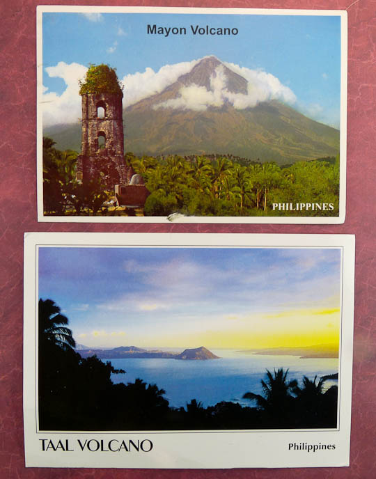
Two very pretty volcanoes.
Boracay is a beautiful beach resort area. Banaue has incredible terraced rice patties.
IRRI Campus which does advanced research on Rice agriculture. Colorful costumes of the Masskara Festival.
Gazing over the water at the beautiful El Nido in Palawan. The last card was sent while a friend was visiting this country.
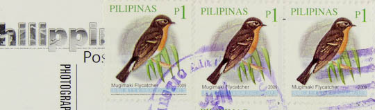
Nice bird stamps and the postmark. Pilipinas is the Tagalog name of the country.
I’ll admit right off that I’m biased. I have two suppliers when I need something to write on: Crane for more formal stationary and Clairefontaine for daily use items like notebooks or pads. That’s why when I discovered the Vice President of Marketing at Exaclair (who distributes Rhodia and Clairefontaine products in the U.S.), Karen Doherty, was offering a notebook for review I jumped on it.
Not too long later I received an example of Clairefontaine’s “Basics” cloth-bound journal in the 6 x 8 ¼ inch size. Looking at the attractive, understated textured brown cover and smooth white, ruled sheets I thought: “So, how do I review this?” Originality is not my strongpoint so I’m going to do what everyone else does with this kind of thing.
First, let’s take a look at the journal itself. It’s spine shows that, indeed, this is clothbound with sewn signatures. When open it’s pretty flexible and lies rather flat. Still, there is a bit of a peak to the page edges nearest the spine but I found this acceptable in this type of binding.
Attractive looking journal, I think. (click for larger image. ditto for all pics here)
The paper is 23lb high resistant, pH neutral, white vellum (yes, I got that from a sales blurb) and, as usual, a delight. The wonderfully fountain pen friendly sheets between the covers are the reason I’ve bought Clairefontaine products for so many years. Since I’ve never found a more satisfying paper then this, which you’ll find in many of their products, I haven’t much in the way of criticism.
With that love fest over let’s put some ink on the paper. I used a variety of fountain pens from a Vacumatic with one of my finest (width) nibs to a Danitrio that puts down a small river of ink. As expected feathering is almost non-existent and bleed through very minor in my simple test. One could not ask for more in something like this.
Fine to medium nib samples.Nibs that put a good deal of ink down.I see almost no feathering on this paper.This is the back of the page with the high ink-flow nibs. Amazing there's so little ink to see.
The journal itself does not look or feel “basic” in the least. The grained cardboard covers feel good and are flexible. Rounded corners are another little extra that helps to raise this item above the fray. While this Clairefontaine journal is not incredibly fancy or hand crafted it’s sturdy and delivers in all the important areas. I’d even buy one…but first I’m going to enjoy this free one.
I don’t plan on reviewing very much in the way of stationary in the future. There are far better places for that such as Biffybeans’ blog. In this case my experiences with the subject of this post have been different than what I’ve generally read so I’m hoping my observations might lend some balance.
Ranking second only to sliced bread in the pantheon of ingenious inventions is lined paper. For people such as myself who are lucky just to be able to walk in a straight line much less write one it is a godsend. There doesn’t seem to be many drawbacks to having those medium blue lines trek across the face of one’s paper but a couple have been mentioned. Aesthetically it detracts from what is written if you, unlike me, write in a beautiful hand. In a more practical sense those gentle blue rules will bisect your page as annoying black slashes when you copy or fax the sheet. Compared to poverty, hunger, and disease these problems are minor and there hasn’t been much of a drive to solve them. However, do not despair; one person has been working on a way to make these foibles just a memory! The fruits of that labor have been sitting on my desk for the last few days.
It started when a friend (hello, Caloy) asked me if I’d heard about the “Whitelines” stationary he’d recently read about. I had not but a quick trip to Google salved my curiosity. Whitelines is a name that says all you need to know about this paper’s major claim to fame. As you might expect the rules on the sheet, either in a grid or as lines, are white. The rest of the sheet is a very light gray which does not xerographically reproduce. How can a line be white, you ask? Is the paper totally gray and those lines overprinted with white ink? Could a bleaching process be in use to fade in those rules? Or could pulp possibly, in some miraculous way, be laid on the wire with white and gray fibers in the proper positions during the papermaking process? Read on to discover this terrible secret!
Google told me that it all started when Swedish designer Olof Hansson got irritated when some photocopies of sketches had those pesky lines appear, black as night, and ruin the integrity of his designs. It was at this juncture his “eureka” moment occurred and the idea of the reversed-out line came to be. After patenting the idea for the Whitelines…er…line a company sprang into being.
So I became intrigued and started looking for somewhere that sold this paper in the United States. Problematically, it’s not widely marketed in North America but I did find one outlet that carried it: Wet Paint. They are a retailer of art supplies in Saint Paul, Minnesota who for reasons unknown also carry this product. Whitelines comes in glued, stapled, wire and perfect bindings in a number of sizes. It’s not exactly cheap to purchase but not so expensive as to enter the luxury goods arena. I bought several of the glue bound A4 pads both lined and with the grid. As long as I was at it I also bought a small pocket notebook to keep my pocket from getting lonely. Since then I discovered that Whitelines has teamed with a U.S. distributor, Consortium Book Sales, so in the future it may be easier for us Yanks to find.
Wet Paint was out of stock at the time of my order so I had to do what I hate most: wait. Eventually the box did show up and in it were pads that did indeed have lines that were white. Closer examination determined that really there were rectangles or squares of gray and line shaped areas of exposed paper. The answer to all my questions was simple: a 10% screen of black (a very rough approximation since I left my tools to check this back with my career in printing) is offset printed on the paper to form the darker surface area. Oh well, it was fun to imagine little gnomes with tiny brushes and cans of white paint while I could.
How it's done: The magic of old printing technology.
First impressions of the 40 sheet pad were that the paper was moderately rough and quite thin. My favorite papers have always been either Clairefontaine or something formal and substantial from Crane (they make the U.S. currency paper, don’t cha know.) As a comparison the Clairefontaine stock in the standard pads that I use is 90g/m2 while Whitelines is somewhat thinner at 80g/m2. The feel of the former’s paper is also quite different being smooth (possibly lightly coated with kaolin) and brilliantly white which gives it a tactile richness not matched by our new gray friend.
The proof of the pudding is in the eating, as they say, so let’s grab our spoon and dig in before I strain this proverb any further. For this unscientific and haphazard test I grabbed a few fountain pens that had differing nibs and wrote on the Whitelines paper a sentence each in my terrible handwriting. Starting at the top with a fine point I finished at the bottom with a music nib to test the paper’s handling of differing widths and ink flows. The paper felt a bit inexpensive as it had more tooth than I am used to and a coarse feel under my hand as it glided across. A few curves were added last and I traced them several times to force some bleed through.
Writing samples on Whitelines paper. (click for larger image)
The results were quite unexpected and disappointing. A fountain pen site had some comments where this paper was given generally good reviews and said to be fountain pen friendly. I found it to be quite the opposite with most all the samples feathering and penetrating through to the back. I admit I wrote at a deliberate pace but this performance would never have occurred on the beloved Clairefontaine. My Danitrio is currently filled with J. Herbin Lie de Thé which seems to have transformed it from ink flow challenged to a virtual inkaholic, and thus it shows the most spreading. The images illustrate my observations so enjoy the sentence repetition!
The bleeding edge: A lot of show-through on back of sample. (click for larger image)A closer look at the top.A closer look at bottom.An even closer look at how the thin and thick lines feather.
In the end my Clairefontaine doesn’t have to worry about being eased out of its frontline duties. Whitelines leaves me ambivalent having those appealing lines that fade away to leave the ink to bask in its own colorant but such a poor performing substrate. I’ll keep using this with my fine and medium points, though, since in the end the novelty of having Whitelines with white lines hasn’t worn off yet. Plus you never know when some lines will ruin your copies.
Update 4/1/09
I did these tests on the Whitelines grid ruled pad. A few days later I took one of the normal ruled pads and did some doodling. I found this pad to have paper that was more resistant to bleed and show-through. Is the paper quality inconsistent? I’m not sure, but I think it’s not a good sign that I could have two pads from the same manufacturer that differ like this. In the end I guess, as with anything, your milage may vary.


